CRITICAL SELF APPRIASAL – ABBIE EASEY-1426049
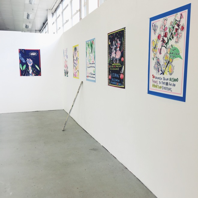
This semester for me has been the one that has had the deepest developments to my practice since starting my degree. Conceptually I am rooted in what I am doing, I feel I have found what I was hoping to find, that of a contextual idea which feels me with questions, motivation and excitement. I think I have fully engaged with all of the learning outcomes from my final semester module, which is Professional Fine Art Practice. The first learning module outcome being, ‘to produce a body of work commensurate with professional standards in their chosen specialism’. Over this last semester I have produced nearly 30 illustrations which are finalised, developed and project the politics and ethics which I have been researching and learning about. They always start as hand drawn initial concepts, which I then alter and finish digitally on the iPad, enhancing them with colour, bolder and more definitive lines and ending with adding in text which is usually bold and contains factual statements. Text is only used carefully; I add it in if I feel it will impact the piece and add something extra to it. The pieces have been exhibited professionally at exhibitions, the latest art exchange exhibition at the University of Essex. I have been approached by the company Bags of love/Contrado and I now have an online artist profile where my designs are available for sale in a variety of different formats, for example my selection of cushions.
The second module outcome being ‘Your ability to independently research and develop your work.’ My research has predomindently always been independent, sometimes I get suggestions from tutorials and group critiques but mainly it has been through my own reading, discovering and searching. One of my most poignant researching experiences was seeing the David Hockney exhibition, even though conceptually Hockney’s work is very different to mine, the colours and the drawings textural marks inspired me endlessly. The huge range of colours, and pastel shades are prominent in all of my pieces and I often refer back to the book of that exhibition while I am working and developing colour palettes.
All of my research is documented in either my blog or in my sketchbook. I record visually with images and captions, this helps me engage further with the information and remember more of the details as that’s how my brain processes information. I have also taken many inspirational and research from Pinterest, books, articles and other exhibitions.
‘Demonstrate detailed and imaginative investigation of a chosen theme or context.’ Is the third module outcome, I have certainly addressed this I feel throughout my work, initially it started out very visually aesthetic based, I struggled to find a way I could combine my illustration and love for colour and have a strong, relevant and meaningful conceptual underpinning. However I overcame this and realised that my strong feminist views were perfect and I had been making work related to this already without even realising. This realisation has allowed me to integrate my female rights movement feelings with my love for illustration and visual depictions. It has been a huge change of direction in my work and has given me confidence, navigation and motivation. I am researching current feminist and female rights related topics and educating myself as I go along.
‘Demonstrate analytical and critical judgement in the development of a body of visual work.’ I have tried to critically analyse and judge my work throughout the entirety of this semester as I know it benefits my development and understanding of where my work is heading. I have had many different critiques, I have realised I love the aesthetic of my work and I think it works perfectly with text, also each piece is very strong on its own, but they become even stronger as a bigger body of work together. This is why my final piece is a 6 piece collection of my illustrations. In my blog posts I have reviewed critiques and tutorials, writing about my own take on certain comments and areas I have felt stuck in. In the beginning I felt unsure of the conceptual underpinning of my work but I worked it out and now at the stage I am today, that time of thinking and realising what is important to me has been really important.
‘Present and contextualize their work in an appropriate and professional manner.’ I have contextualised my work in an appropriate and professional manner by having my work on many professional social media platforms, I have two blogs I am updating as I go along and once I graduate will be putting more time into. I have taken professional photos also of my work as it has been changing. I have a large portfolio of finished illustrations which are in a folder ready to be presented whenever the time may arise, and will be perfect for my MA interview in Illustration.
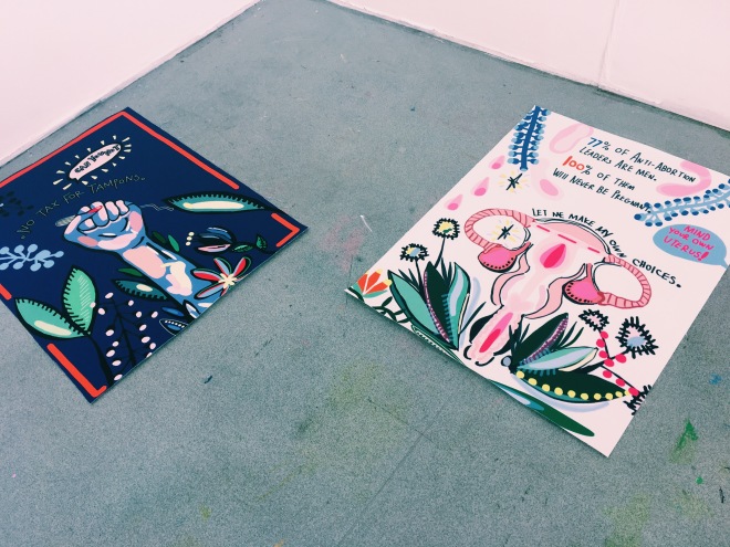
The conceptual underpinning of my work is based upon female rights, female related issues and the area of female issues which in society are outdated, unneeded and rude. I try to keep my research direct and look at mainly issues within the UK and issues which are current and happening now. This allows me to speak about problems which are affecting me and the society I am a part of. One of the main issues I have been writing about and researching is the gender pay gap in the UK, this is a huge issue not only is it estimated to be abolished by 2067 which is insane it is affecting working women every single day who are getting paid less for doing the same job. It’s outrageous and very much under spoken about, many people aren’t aware of it, or believes it is still happening.
My work is mainly about, spreading true accurate information, educating people in a direct but not pushy manner. Getting people talking about issues which are the elephant in the room, or are being simply dismissed because ‘that’s the way it has always been’ I shouldn’t be receiving in my local area 12% less pay than my male equivalent in 2017, the government says it is at its lowest ever, but it’s still present, denying women the money they have rightfully worked for.
The quality of execution and my practical understanding and control of materials has been a continuous thought and consideration. I originally wanted my work to be a tapestry but practically I would not have been able to achieve that myself, skills and time wise and I couldn’t find any company which allowed you to have your own design completed as a tapestry. In the end I chose to have fabric prints, this actually turned out to be an amazing choice, as the detail and levels of colour which can be achieved have been incredible, with working digitally it is always a worry, taking your imagery away from the screen, as on the screen it is backlit, altering the realistic levels of light it may actually hold. The prints have come out identical to the digital images which is a relief and an excitement. I did samples from a couple companies then found the one I preferred, Contrado. The way they are printed, I have gone for a political poster aesthetic, I wanted them to look like signs or wall hangings from the past which could have been used in protests. The size dimensions are perfect for this visual and I feel that I have achieved that political and bold aesthetic. The vibrant colours have helped the levels of intensity increase as well. I have constantly been referring to images of inspiration, the mining posters and other political based pieces of history; these have fuelled my designs and added little details for authentication for example adding borders to some of my pieces, to try and create my own modern day political posters.
My main contemporary and historical underpinning has been political research over the last 100 years. This was the concept for my dissertation and I have continued the research over to my main module to fuel that and relate the two. I have read many books on the social state of Britain and the underprivileged, my latest strain of research being women’s rights which has come in at the end of my degree has been mainly reading many current articles and watching interviews online. I have been reading from every angle and making sure I am working with accurate, relevant and important factual statistics and evidence. I have brought my own opinion in to the matters as the views are how I equally feel as a woman. While posting my work online I have managed to reach the widest spectrum of women, I have had feedback from international women of all positions and ages it has been detrimental, motivational and incredible to be able to feed that back in to my work, helping it grow, develop and flourish in the right direction. I am looking forward to continuing to create these political based illustrations and bodies of work as I feel these are educating, inspiring and humouring women of all backgrounds, and enlightening men and other women who aren’t potentially aware of the society we are in, but I am positive change is coming.