NEARLY READY FOR THE ART FAIR!

Processed with VSCO with c1 presetcnge6250

NEARLY READY FOR THE ART FAIR!

CHARACTER DEVELOPMENT.

I’ve been thinking about developing a series of people? which can become familiar, and reused in certain situations. Here is a little person in a Beret wrapped up for winter! He has a certain french Art-Deco feel to him, I have been inspired by Edward Burra, I have a post card of his painting ‘The snack bar’ in my studio space, and each day I look at it and just think I love those faces! I love the ridiculously long eyelashes, and extenuated nose. So beautiful, the imperfections and unrealistic features are exactly what I embrace! my drawings are based upon the pure fact none of these people are physically proportional, making them technically mystical. The elements of magic and mystery are becoming more and more apparent in my work. I really enjoyed creating a character and then having him move from drawing to drawing. It felt contained! in a good way.

15134700_1658868304443826_1321529044492789706_n15036272_10207964656622755_7671694142626930123_n15078559_10207980300693847_7931803182076692434_n15036759_1659283084402348_4162915512361193644_n15095083_1659283081069015_2073004344695456404_n

CHARACTER DEVELOPMENT.

CHRISTMAS CARD SELECTION! YAY.

Here are the five definite designs I have so far, I am thinking a couple more maybe three more designs and then ill be ready for our Christmas fair.. and Christmas! so exciting! cant wait to experiment and print a few to see how they print out.

CHRISTMAS CARD SELECTION! YAY.

GEE VAUCHER

“Introspective is Gee Vaucher’s first major institutional show in the UK, and spans the artist’s career of more than forty years. It charts Vaucher’s journey from local activity to international ambition, from domestic concerns to world politics, and from healing the planet to healing the mind. Including collage, photography, photo montage, painting, sculpture, film, performance, typography, sound and installation, the imagery she creates ranges from the absurd and often comical to the harrowing. Her message spans the political and the personal, the environmental and the humanitarian.”

This exhibition was full on! there was so much work, and it was all really really varied, it showed how skilled, intelligent and interesting this lady is! I loved her political work, it was so strong, and so relate able. It got the message across with 0 words, that’s when you know power has been achieved! When no text is required to aid your message.

GEE VAUCHER

WE NEED CHANGE.

This started of as a little sketch of a table and chairs in a coffee shop, which evolved in to a mini poverty poster!

I have been reading so much lately about the hidden and unspoken inequality and hardship that goes on in Britain that no one speaks about, and most probably don’t even know about, for example these insane poverty statistics.I think when your’e eating a cinnamon swirl with a soy latte you realise how lucky you actually are? and that a cinnamon swirl probably isn’t a life necessity (no its definitely not). So all of us in that coffee shop that day who were spending too much money on cake, are lucky people to even be able to have that as a opportunity to us, and i completely recognize that.

The fact that 1 in 4 kids live in poverty I think is really really sad, as like I wrote we have recently been promoted to the 4th richest Nation in the world, which is quite a worrying idea. I’m not sure how exactly we can change this, well Theresa May you could set the ball rolling, but on an individual non Tory basis, I think talking about it is actually quite a good starting point? most issues need the awareness raised first, then they can be tackled. I read this article and couldn’t help thinking, I bet most people don’t realise this? that Poverty cant always be seen, that that women next to you on the bus may not have eaten because she had to feed her children first?.. Social inequality really fascinates me, I believe together we can change these harrowing numbers, 0 children need to be living in poverty, its a loop hole in the system which doesn’t care about the bottom band of people, the people who aren’t medical graduates, you know? people who work in their local pub on a 0 hour contract to then have £20 left at the end of the month.

14993404_10207899834562244_4649603500457867492_n

WE NEED CHANGE.

‘CONVERSATIONS’ EXHIBITION!

So my work is currently being shown at The Minories Gallery in Colchester! in an exhibition called ‘conversations’! so exciting. My piece is a unique photograph, of two negatives layered together to create a surreal, almost geometric collage of information.

img_3206
Posing with my name on a poster.
img_3203
Come along and check out the exhibition!

img_3204

img_3205
My work on display!


‘CONVERSATIONS’ EXHIBITION!

DISCOVERING MIKE KELLEY.YAY

Much to my tutor and other people’s shock I had never heard of Mike Kelley.. and it wasnt like sometimes you know of an artists work but you aren’t sure of who created it, I have never seen a single piece created by this amazing man! So what a great discovery! We went to see his piece ‘Framed and Frame’ at the Hauser&Wirth Gallery, It was a great piece, I liked how mystic and magical it felt almost? I like getting that feeling, for me the less serious a piece is visually I think the more I enjoy it. Especially if it has a serious concept, I quite like that duo… a fun aesthetic with a darker and subdue meaning. Now I have googled Kelley to the deep depths of googles ends, this is actually one of his pieces I least enjoy, his work involving lights I am in love with, they are beyond beautiful.

For me once I started researching him and saw his other work I found that connection, when I saw his piece ‘Framed and frame’ I wasnt as excited as when I saw his other work. I do love the colours but I’m not sure, I just didn’t have that feeling where you are just smiling and can’t stop looking. There were smaller aspects of it I did enjoy, the colourful religious mini statues, and the mattress underneath. I think it was the concrete as a base material I didn’t enjoy! Conceptually I engaged with his idea, and understood his interests and where this piece derives from completely. I really like the idea of where do the real and imagined meet? what is that space? and can it be visualised! This piece is also extremely historical and political, I like how he has conveyed those thoughts via a magical grotto, cave, wonderland.

mike-kelley-18tumblr_nuozi2vyjz1t4t81io1_1280Assignment Number_Section: AA, ME, SP, CA etc._Assignment Slug_Kmikekelleyjpg-7c8847eeaceb0b29tumblr_o2i0svom511rx9xdlo5_1280

DISCOVERING MIKE KELLEY.YAY

MY WORK RIGHT NOW?

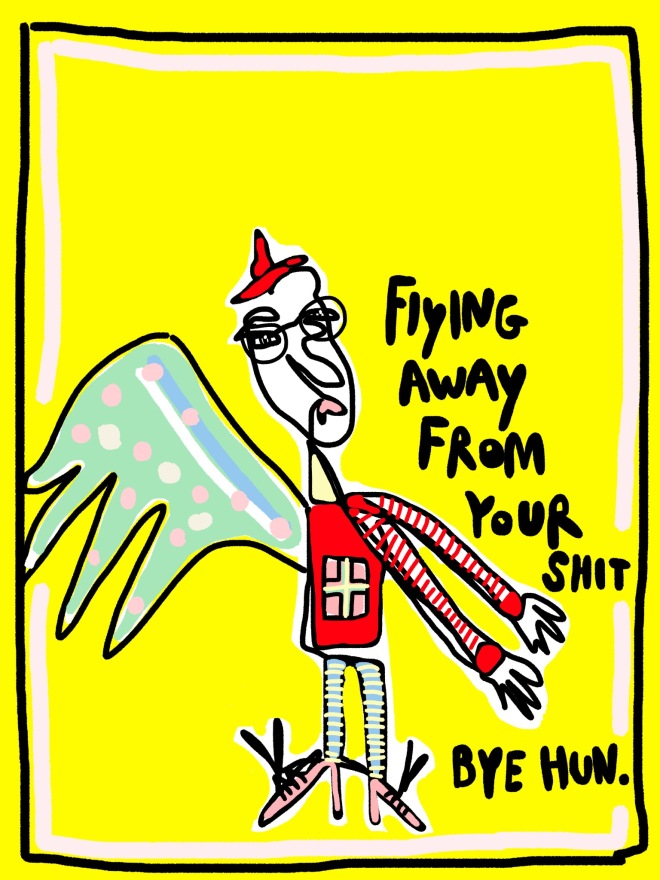
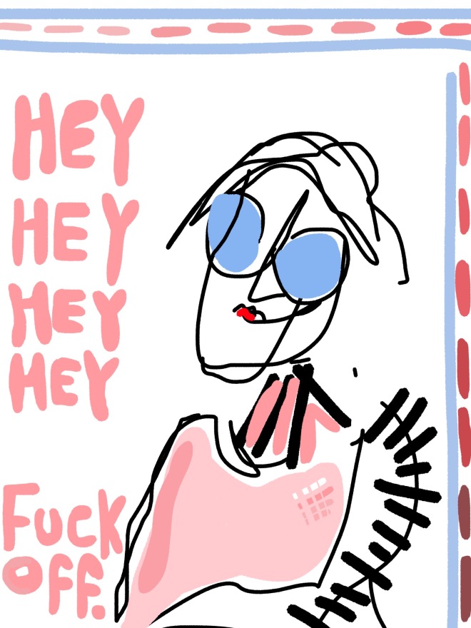
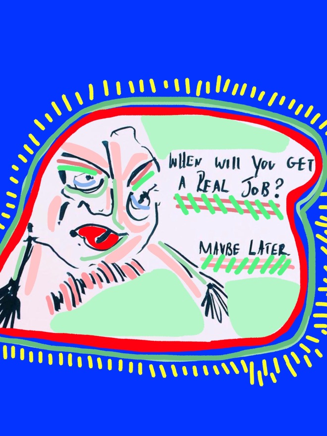
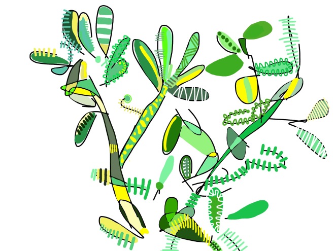
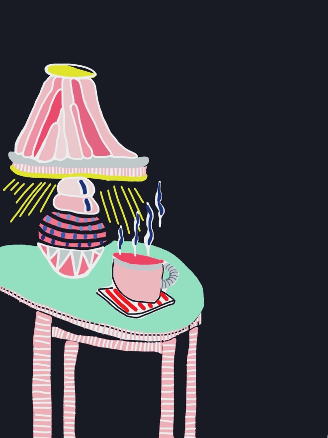
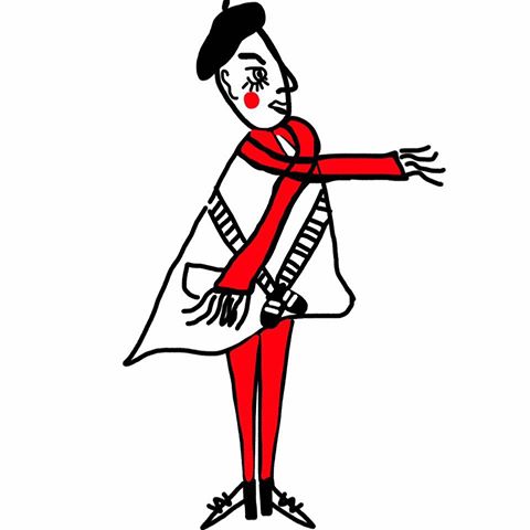
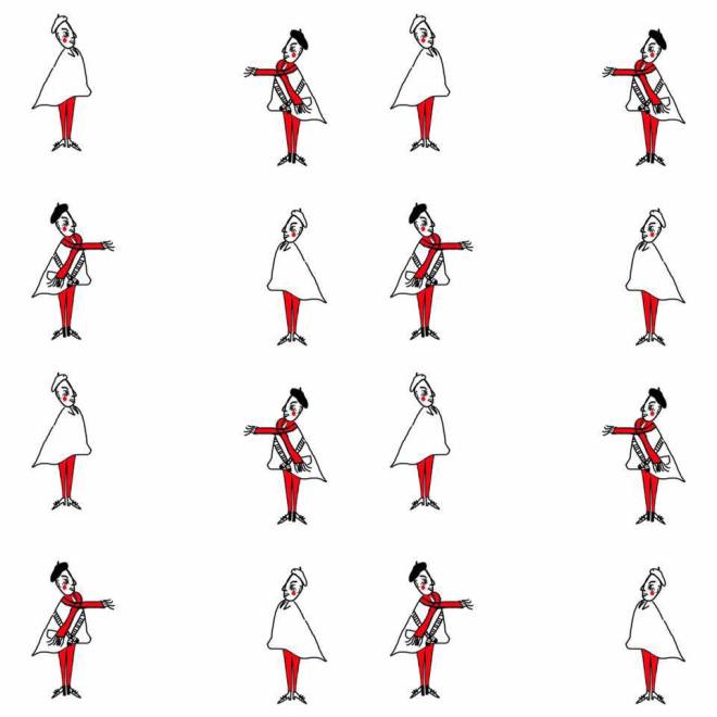
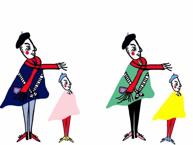
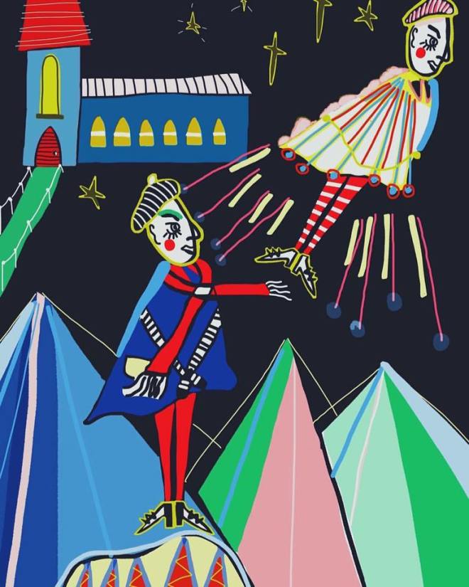
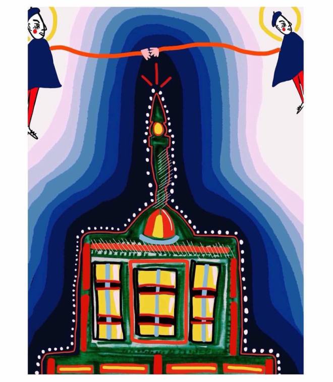
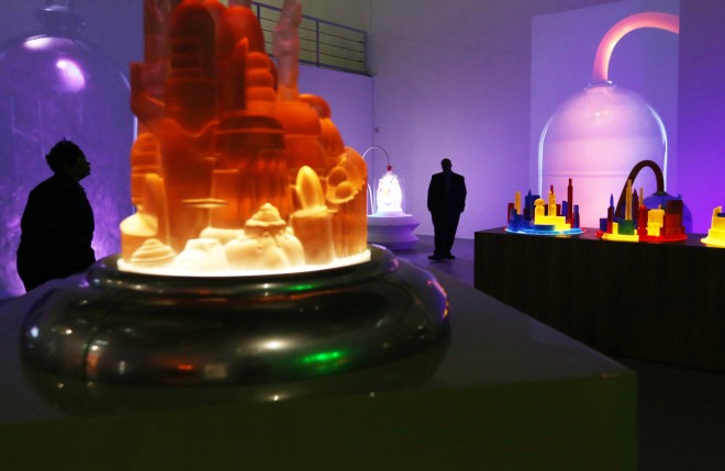
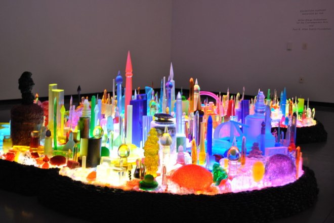
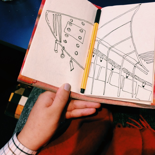
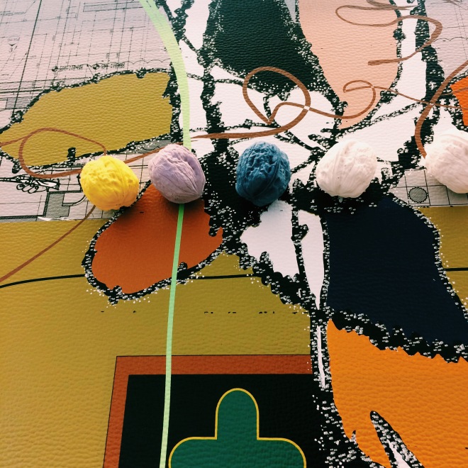
My illustrations are becoming more and more stylised, I feel that the more I do, the more they are becoming my own language, of fonts, characters and markings. They subconsciously have similarities which identify my style of working and thought patterns. Before I used to be worried that each drawing should have a deep meaning, but now ive realised some may be strongly political and have a powerful message, but some will be a comment someone has made to me, or I have over heard and that’s ok. You can’t make meaningful work ALL of the time.. I don’t think? Sometimes it needs to be a drawing of that lampshade that you can’t stop looking at.

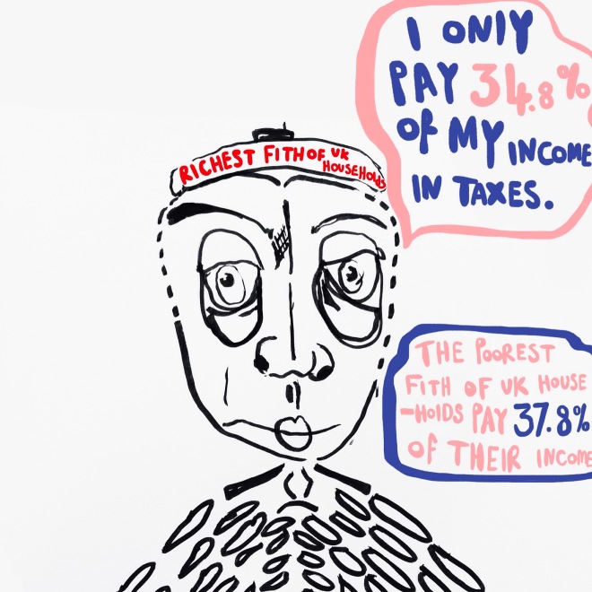
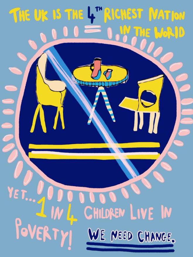
I’ve found with this attitude that the political and more serious drawings tend to flow better, as im not pressurised or forcing it, I’ve been reading more and more into the complex.. and slightly well majorly shocking statistics of the country in its present state and been making a lot of notes. The thought I had is that, many people including people I know personally, simply aren’t going to read a 18 page report on the new-found increased levels of people living below the poverty line across the uk in 2016..They just wont! So I thought if I make notes on really important, true facts about our society that can be one or two lines, which can be incorporated in to a bright illustration, people will take note!

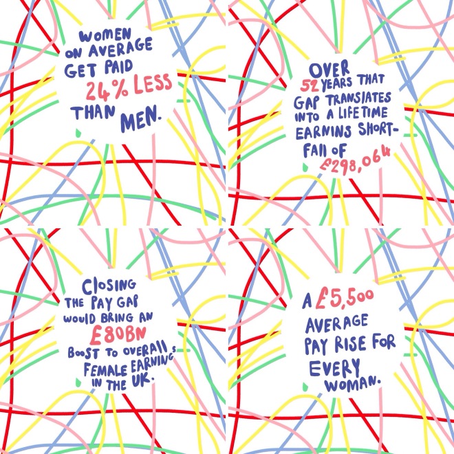
I tried this idea out with the article I was reading about the pay gap for women from statistics from this year (I was as shocked as anyone). I made a series of four illustrations, where I summarised what I had read over about 12 pages and got to the main crux of the issue…. that working women get paid 24% less than men. Horrendous. I posted this images on my social media platforms, and the reaction was amazing! so many people had no idea about this, many thinking there was no pay difference! so many women were commenting and speaking out about it. It was great to think I had in four images, spread so much awareness and basically got people thinking! which is the main thing, about such a huge problem!

So I think in a non-fancy way of explaining my work, I care about society and im interested in all of its disadvantages and unfair and outdated ways and I want to talk about them, get people talking about it and to really to raise awareness of issues that aren’t spoken about via the media (enough anyway) and to change ideas. Social class structure is at the root of my feelings and I think il always be interested in that, but its been great looking at women’s rights and in to poverty aswell, they all interlink anyway, so after lots of reading i’ve felt really excited about what I am going to report on!

The mixture of non serious and factual illustrations I think is crucial and really fun. Together I think they will all eventually make a beautiful book! yay.

abs-ipad-574abs-ipad-571abs-ipad-559abs-ipad-554abs-ipad-543abs-ipad-532abs-ipad-530abs-ipad-495abs-ipad-498Processed with VSCO with f2 preset

MY WORK RIGHT NOW?

SKETCHING AT THE HAMPSTEAD.

Wherever I am I seem to be fascinated and attracted to lights, and architecture, I love sketching shapes of buildings and the different lights, and their formation! The downstairs of the Hampstead Theatre had a curved wall like the one at Firstsite gallery, and these rows of little bright lights, with the alluminated staircase. Aesthetically it is beautiful and the ratio of light to darkness was perfect. I really enjoyed being there and drawing, I did a version on my ipad, adding in pinks and pastel tones. I think it brought it to life!

Processed with VSCO with b5 presetProcessed with VSCO with c1 presetabs-ipad-582abs-ipad-581Processed with VSCO with acg preset

SKETCHING AT THE HAMPSTEAD.

Helen Marten: Drunk Brown House

Processed with VSCO with c1 presetProcessed with VSCO with c1 presetphone-piczzzzz-089Processed with VSCO with c1 presetProcessed with VSCO with c1 presetphone-piczzzzz-097phone-piczzzzz-103

Her installations employ visual and linguistic ambiguity in order to explore the potential for misinterpretation and misunderstanding.

Marten’s sculptural installations often serve as repositories for disparate material combinations, resulting in an exhibition that calls into question our changing relationship to the readymade. Underscored by a process of collaged abstraction, her assemblages resonate with associative meaning.  Creating a string of hieroglyphs or a kind of archaeological anagram, the work’s encrypted sequences are nevertheless driven by their own internal logic

“I’m really interested in the point at which things become husked down to geometric memories of themselves, where a house, for instance, a pair of legs or a cat could be communicated with huge economy and speed via just a few lines. The vector can become a mechanism of delivery. As incorporated extensions, even a simple nod towards a shape that might be reminiscent of a readymade form is quite literally a vocaliser of external things – an agent of the world outside art-making. And this is the point where you can use recognisable authority, the obstinate fact of a universally existent thing – an arm, a teapot, an alphabet – and extricate it from its own sense of intentionality.”

-http://www.serpentinegalleries.org/exhibitions-events/helen-marten-drunk-brown-house

I really loved this exhibition, I think its the only work I have ever seen where it honestly felt like these were abstract drawings or 2d works brought to life! Such a surreal feeling, if you stood back from afar, and squinted a little then they could easily be a huge 2d print. I think as there were Martens screenprints exhibited with the 3d work, then maybe this is why I was imaginigng it, but it was amazing! I loved it, and that there were 3d objects attatched to the 2d work aswell.. it felt like all barriers of 2d/3d had been crossed and actually it didnt really matter, and I think after reading what Marten says about her own work, this is what she was trying to convey, that its taking that meaning away from objects, and having them in this new alien format with no meaning or a new meaning. I was so taken back.. painted walnuts forever! amazing. Very inspiring.

Helen Marten: Drunk Brown House